Material-UI v1 is out 🎉
React components that implement Google's Material Design.
 header & logo by @hai-cea](https://cdn-images-1.medium.com/max/2050/1*BKssrX-qEmyN6YaRNTvNlw.png)
Our new documentation header & logo by @hai-cea
It has taken us two years to do it, but Material-UI v1 has finally arrived! We are so excited about this release, as it's setting a new course for the project. Thank you to everyone, especially to the team, and to everyone who's contributed code, issue triage, and support. Thank you.
✨✨✨ See the 1.0.0 Release Note on GitHub. ✨✨✨
One button
High-level Goals for v1
Material-UI was started 3 years ago by @hai-cea. The React ecosystem has evolved considerably since then, and we have also learned along the way. Two years ago, @nathanmarks started an ambitious task to rebuild Material-UI from the ground-up, taking advantage of this knowledge to address long-standing issues in customizability, ease of use, and code quality.
Customizability
Material-UI v1 is our second stab at the execution of the vision. We want Material-UI to become whatever is generally useful for application development, all in the spirit of the Material Design guidelines. Material-UI is not only an implementation of the Material Design guidelines, but a general use UI library of components that are needed by many. We are even allowing developers to build non Material themes on top of Material-UI components. We will soon open source examples of this.
CSS-in-JS. We have seen a great potential for inline-styles in the past. It was an opportunity to solve four problems at once: removing the LESS toolchain dependency, allowing dynamic styles, allowing style code splitting and make overrides simpler. Unfortunately, the execution didn't deliver. We were lacking key features only available in CSS: media queries, pseudo selectors, pseudo elements, browser prefixes. Debugging was much harder. Overriding styles was very challenging – developers always had to look the implementation, and couldn't use CSS without relying on !important. Two years ago, we decided to move away from inline-styles toward CSS-in-JS. We are very happy with the outcome. We would like to thank @kof for the awesome work he has done with JSS, the internal solution we use. It's allowing us to be interoperable with all the other styling solutions.
Theme. You can't have a good customizability story without a good theming story. We have been redesigning the theme. It's a JavaScript object that contains all the variables and utility functions you might need to style your components: a palette, a typography, breakpoints helpers, transition helpers, etc. The theme object can be dynamic and nested.
Ease of use
We know the ease of use is a critical part of user acquisition. The more user we have, the more likely we can make the project sustainable. Improving the ease of use comes in different flavors:
Onboarding. We have reduced the onboarding friction as much as possible. We know the onboarding is a critical step for user acquisition. The onboarding friction comes in different flavors: We have reduced the number of installation steps needed. It should be as simple as 1. npm install @mui/material and 2. import Button from '@mui/material/Button'; . We don't ask for polyfill, custom webpack plugin or any specific build tool. The usage of MuiThemeProvider is no longer mandatory.
Examples. We are hosting example projects with the most popular solutions to start a project: create-react-app, Next.js, Gatsby, and CDN.
Isolation. Our components now work in isolation. You should be able to use a single Material-UI component in an existing codebase without any side effect. No global CSS override needed, no bundle size bloat.
Documentation. We have made a huge investment in the documentation. We use Next.js for a blazingly fast navigation experience. It's also allowing us to provide a first server-side support for the components. We had added a search bar powered by Algolia's DocSearch. (don't miss the s shortcut to focus the search bar). We have added many new documentation sections: guides, FAQ, etc. We have made the demos more interactive thanks to a direct integration with CodeSandbox.
DOM. We have focused on providing low-level components, in this v1 rewrite. By low-level, we mean components as close as possible to the underlying DOM structure and as stateless as possible. It should help reduce the mental overhead of using the components, encourage interoperability, and simplify customizability. For instance with the TextField. The component was broken down into 4 components. Our Input exposes the same API than a native input. You can switch one for the other. Leveraging this structural choice, we were able to demonstrate 3 autocomplete integration example with Downshift, react-autosuggest, and react-select.
Code quality
Many people discover web development through Material-UI but it's also used in production to serve millions of customers. We have an important responsibility, our implementation needs to be rock solid.
- Best practices. We are following the best practices as much as possible. We have made the components: fully accessible, fully HTML5 compliant and SEO friendly.
 report of the Material-UI documentation homepage](https://cdn-images-1.medium.com/max/2000/1*_x_j-jasswGw0WaDyeHk-g.png)
Lighthouse report of the Material-UI documentation homepage
- Continuous integration. Every single line of code is tested. We have an impressive 💯% test coverage. With more than 700 contributors, it's really important. All these tests allow us to quickly iterate and with confidence. We run the test suite runs on all the supported platforms. We also run more than 180 visual regression tests thanks to Argos-CI.
 build](https://cdn-images-1.medium.com/max/2000/1*bnWGqotk36ivrYTp3dY7fA.png)
An example BrowserStack build
- Bundle size. If you take all the Material-UI components, your bundle will weight more than 100 kB gzipped. Material-UI looks like a huge dependency but it's fine in practice with code splitting. You will most likely use ~40% of the library on a given page/screen. The bundle size is important. It's constantly monitored, which prevents us from introducing size regressions, and allows us to recognize positive efforts.
 output](https://cdn-images-1.medium.com/max/2000/1*AQoyq9OvjFZJE2Ep0UtCzA.png)
An example of size-limit
- Development warnings. Because the API surface of UI components is so large, it's easy to leave the beaten path. We have condensed a large number of the issues raised into a number of informative development mode warnings to help you stay on the right track. Aside from propTypes, we have added more than 20 warnings, and the list will grow as we discover more edge cases.
What's new in v1?
There are so many new things, we can't be exhaustive. Aside from what we have already announced, you will find:
- Simpler and more powerful theme
- Grid layout component
- New documentation
- Right-To-Left support
- First class server-side support
- Premium themes
- First class TypeScript support
- And much, much more
What's next?
Material Design. The Google Design team has recently released a new iteration on the Material Design guidelines, it's focused on themability. This is great news! We will do our best to be up to date. It also confirms that heavily investing in customizability for v1 was a good call. We will continue our efforts.
More utils. We want to work on new utility components: Spacing, Display, Color, etc.
Documentation. We want to host multiple version of the documentation. Each minor release will bring a new hosted version of our documentation. Right now, we have v1.0.0, and come v1.1.0's release, we'll add that too. Prior releases will continue to be linked from our navigation as is already the case for v0.x. We want to translate the documentation into Chinese and more languages. Any help is welcomed!
Learning materials. The quality of the documentation is equally as important as the quality of the implementation, and while the reference documentation is comprehensive, we could author a learning tutorial like Next.js has done, or an egghead.io course.
Themes. We want to provide common layouts example to make getting started even easier. We also plan on adding more premium themes.
Performance. We can't optimize something we can't measure, and we don't currently have a CI performance benchmark, so we will need to build one and start investigating bottlenecks.
Bundle size. The library needs to be as small as possible, so we need to work on solutions to further reduce the bundle size, for instance, supporting Preact or Nerv can help.
Type checking. We will continue to improve the TypeScript and maybe the Flow coverage of the library.
Premium themes
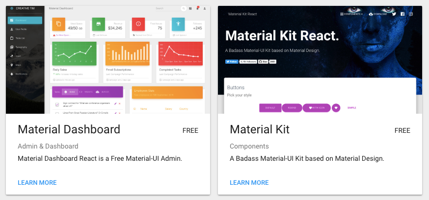
We have shipped the long-awaited Material-UI v1 stable release. With a new codebase designed to better support customization, it's the perfect timing to start building and promoting premium themes. We are very happy to announce the first two from Creative Tim. More are coming.

Creative Tim themes

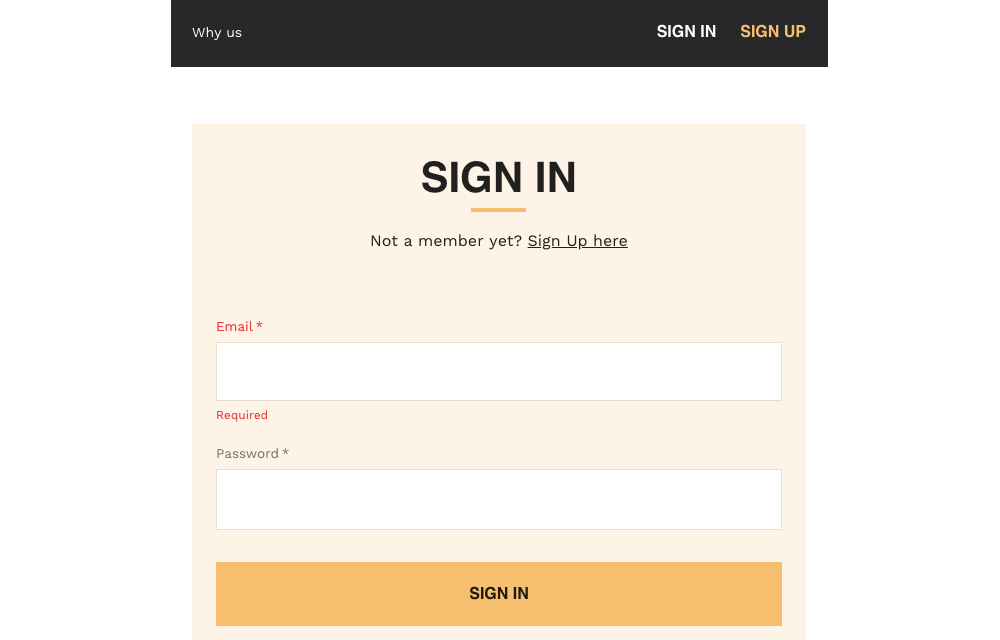
A preview of an open source theme we will soon release.
Thank you
Finally, one last thank you to everyone who's contributed to Material-UI v1. I'm so excited at the idea we are making it stable, but rest assured, it's just the beginning. We will keep working hard on delivering the best possible UI library components.
Material-UI is an MIT-licensed open source project. It's an independent project with ongoing development helped by the support of these awesome backers. If you'd like to join them, please consider:

Our gold sponsors
- GitHub: https://github.com/mui/material-ui ⭐
- Twitter: https://twitter.com/MUI_hq