Material-UI is now MUI!

Starting today we are evolving our brand identity to clarifying the difference between our company and our products.
- Material-UI: the organization is now called MUI.
- Material-UI: the set of foundational MIT React components is now called MUI Core.
- Material UI: the Material Design components developed by MUI. Also, we ditched the hyphen!
- Material-UI X: the set of advanced React components is now called MUI X.
Our previous name was no longer serving our areas of focus. We have grown our product offering. We needed a new identity to match our increased scope.
The origin
Material-UI started as a React implementation of the Material Design guidelines in 2014. The goal was simple, to empower React developers to use Material Design. The community loved it and was craving for more, so we kept building.
We made it easy for the community to contribute and started actively reviewing pull requests and guiding issues. Over 2,200 developers have cared enough about our mission to contribute, so far. Things started to really take off with the release of v1 in 2018. The frontend community was actively migrating to React, but didn't have the bandwidth to rebuild legacy interfaces from scratch, so before we knew it, we had grown into the most popular React UI component library. The components were heavily used and customized to build customer-facing applications, internal tools, and mobile-hybrid apps.
A larger focus
In our last survey, the number of developers that commented about improving the Material Design implementation was down by 60% compared to the year before. At the same time, 5X more developers were struggling to customize the components.
It was based on this context that we started work on v5 in 2019. Our primary focus was to revamp the customization Developer Experience (DX). It had become clear that design (aesthetic, UX) and DX were key to unlocking the next stage of growth.
The new brand supports the v5.0.0 release while also creating space for new initiatives that broaden the company horizon. It's a big deal!
Our ultimate goal is to become the most effective and efficient tool to build UIs while making it accessible to the many.
Our new brand
Let's dig in.
A new name
We are breaking the strong association with Material Design as we have seen too many people confusing Material-UI with Google, or as a synonym of Material Design.
We are now called MUI. It stands for Material to build UIs and is pronounced /ɛm juː aɪ/.
It's shorter, it distinguishes us, and it's familiar – many people already used it for abbreviating Material-UI. More importantly, it allows for the release of products not directly coupled to Material Design, such as an unstyled/headless version of the components, a brand new second design system as an alternative to MD, and more ambitious initiatives.
A new domain name
A new name wouldn't be so official without a new domain, so we have moved home from https://material-ui.com/ to https://mui.com/, a very easy to type (and find) domain.
New logos
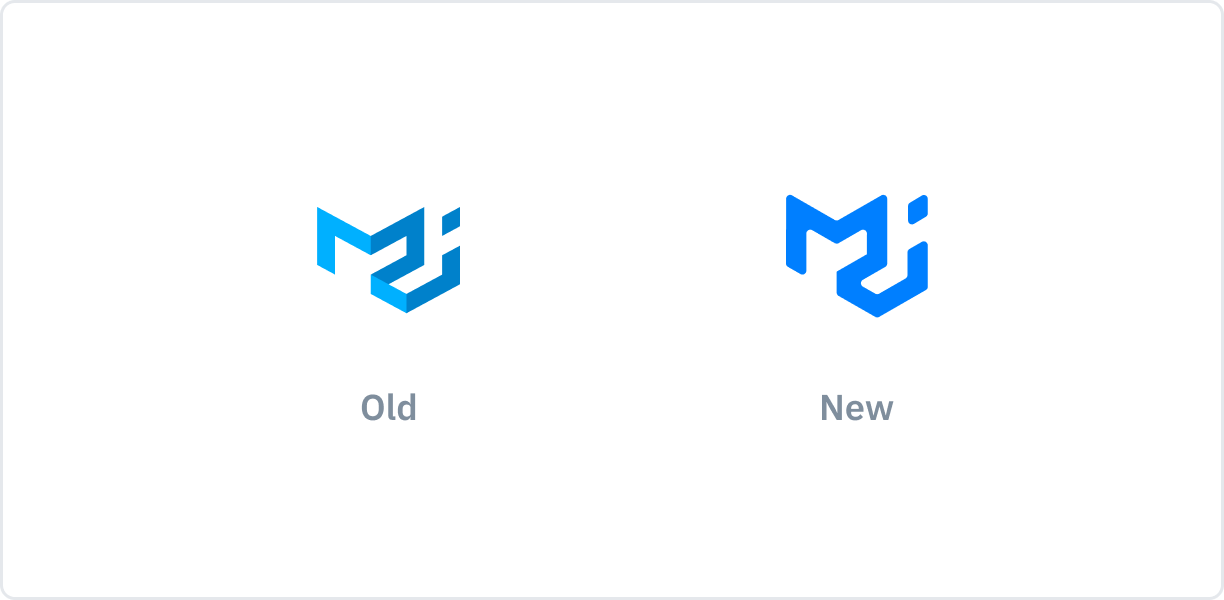
We've tightened up the company logo to match the new brand.
It's basically the same, to keep it familiar – we're keeping the geometrical shape, to resonate with the building blocks idea of the components – however, we're reducing the emphasis on the 3D perspective, stepping away from the notion of elevation that Material Design coined.

To better identify, market, and promote each product, we're introducing logos for each one of them.

- MUI Core contains ready-to-use foundational components, free forever.
- MUI X includes advanced and powerful components for complex use-cases.
- Templates is a collection of fully built, out-of-the-box, React templates for your application. They are developed by the community curated by us for quality.
New package names
The package names have changed in v5, which is a breaking change. You can find more details in the release notes. The npm organization name (scope) has moved from @material-ui to @mui.
A new website & documentation
Lastly, to celebrate the start of a new chapter for the company with the release of v5.0.0, and new products in the making, we're introducing a brand new website and documentation design.
You'll find a completely different theme from Material Design – new typeface, colors, box-shadows, and more, all done using the flexible theming features of v5.

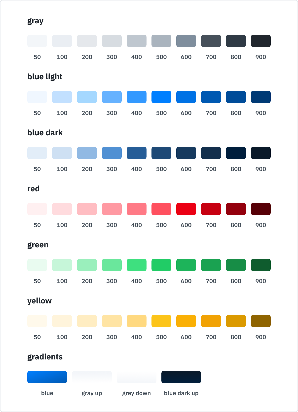
The color palette of our brand.
Note that these changes do not impact the design of the components released under the
@mui/*npm packages.
The path ahead
There are many more exciting things to come in the future as we roll into this new chapter. We're grateful to have you with us, supporting the library, and helping it grow and mature.
Material Design will continue to be supported with the same attention to detail as before. We aim to keep serving those who like the library for closely following MD, while also leveraging the strong foundation built so far to offer new components, designs, and products.
We hope you like it. Happy building!